
 The exhibition was Cloth: Seeds to Bloom at the Australian Design Centre. The book is ClothBound. The artist’s website is juliepaterson.com.au/ and the shop is clothfabric.com/. There was also a Designer in Residence gig during the State Library‘s Australian Inspiration exhbition. Julie Paterson has been a designer and printer of contemporary textiles for over 20 years, and it seems that this year was her time to share her journey, process and work.
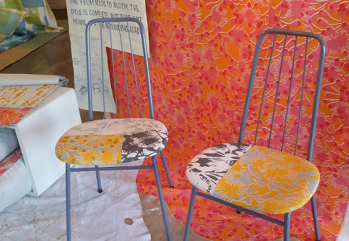
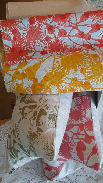
The exhibition was a series of vignettes, themed to display significant textile collections over those years. Seeds was the earliest – overlapping squares based on studio colour exploration, a curly design developed with brush and ink direct on fabric and a third design coming from dye experiments by Paterson’s then business partner.
Paterson’s book is beautifully designed, richly illustrated and full of insights on her processes. Founded in a printed textile design degree in the Midlands of the UK in the early 1980s, her evolved approach has many parallels with what I am learning through OCA today. This is process driven design, based on experimentation, prototype with play and experimentation and “seeing the richness in the small details that I might previously have overlooked” (ClothBound page 33).
Sketchbooks are constant travelling companions, filled with words as well as sketches as Paterson gathers notes, stories, motifs, inspiration from her life and travels. She welcomes mistakes, dead ends, responding to results of process, while also recognising the need to “balance our intuition and spontaneity with time for reflection” (page 59).
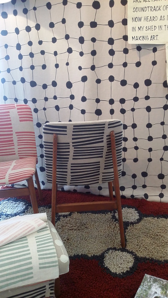
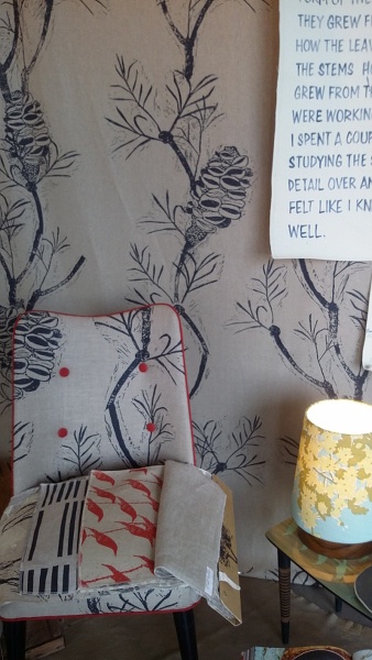
A recurring approach is torn or cut paper used to make stencils. In one collection ripped strips of cartridge paper were used, giving “nice and fuzzy” edges to create stripes. The striped design was joined with one of discs or dots, another of irrregular checks, and finally a coordinate, busy and at smaller scale. A stripe, a dot, a check, a co-ordinate – a collection. Each collection displayed formed a cohesive group, and many individual designs have continued to be produced and work together in the wider range.
For many years Paterson has worked with the same printer to produce the commercial range, and the relationship and trust built has allowed even more creative flexibility and innovation.
Considerations in design I want to remember – proportion, not too predictable, a natural rhythm, variation in scale, negative space, flow. Multiple elements can be built up into a complex design, or broken down into individual parts that once again provide cohesion, interest and variety.
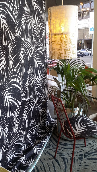
I was surprised by how appealing I found these textiles. In general I am not very interested in interior design. However there appeared to be a warmth and honesty in this work, a timelessness rather than fashion approach. Most of the materials are natural, hemp being a particular favourite, and there is texture and substance. The “simple” geometric designs have a quirky independence, and the bush and tropical motifs are both familiar and fresh.
A lot to enjoy and a lot to learn from.
T1-MMT-P3 Exhibition and book: Julie Paterson
Textiles 1 – Mixed Media for Textiles
Part 3: Molding and casting
Exhibition and book: Julie Paterson

I agree with your evaluations here, Judy, and the spirit of experimentation seems to fit well with your own work at the moment. Particularly interested in the idea of using torn paper for stencils.
Yes, she is able to get a lot out of deceptively simple methods.